

BIOVERSE Experience Redesign
BIOVERSE: Redesigning Survey Flow & Product Page
In this 1-week sprint, I was tasked with redesigning the experience flow for their care survey and the product page for their medications.
What's in Store
-
About the Project
-
Competitor Research
-
Design Audit
-
MVP Designs
-
Next Steps

About the Project
Problem Space
BIOVERSE seeks to redesign their product landing page by updating the UI to better compete with growing competitors, all while maintaining their current branding.
Our Users
People who want or need access to medications but they can't afford them or their insurance does not cover them.
Team & Tools
Team: UX/UI Designer (me)
Tools: Figma
My Responsibilities
-
Complete 1-week sprint, balancing speed & quality
-
Led design and competitor research to inform strategic decisions
-
Created design mockups aligned with UX best practices and competitor insights
-
Delivered high-fidelity designs and an interactive prototype to the client
Competitor Research
I compared BIOVERSE's site offerings to the sites of 3 competitors:

eden
✅ Affordable Pricing
✅ Survey
✅ Rounded CTAs
✅ Large Images
✅ Negative Space Balance

hers
✅ Affordable Pricing
✅ Survey
✅ Rounded CTAs
✅ Large Images
✅ Negative Space Balance

ro
✅ Affordable Pricing
✅ Survey
✅ Rounded CTAs
✅ Large Images
✅ Negative Space Balance

BIOVERSE
✅ Affordable Pricing
✅ Survey
❌ Rounded CTAs
❌ UI not aligned/spaced well
❌ Too Much White Space
Design Audit: Product Page
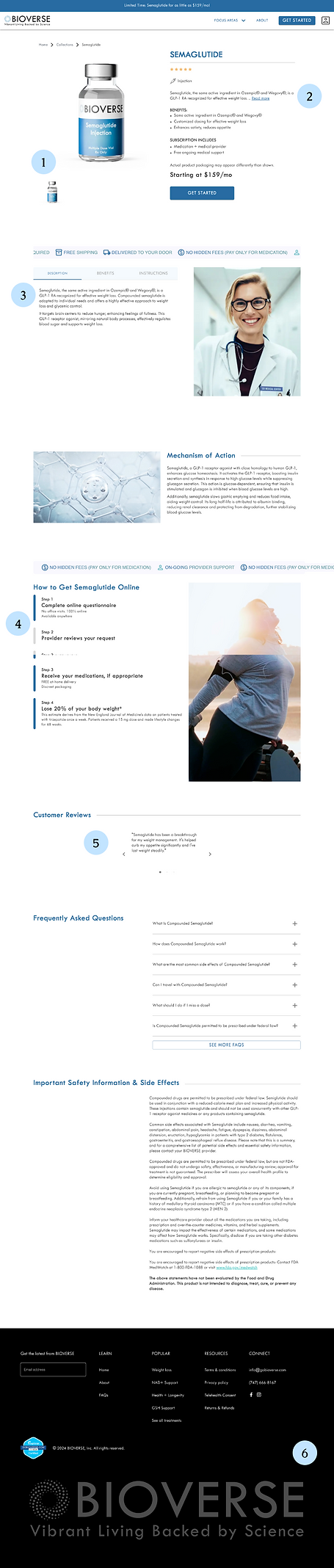
1 Product Image Looks out of Place
When a product image has a clear background, it can make the product itself look like it's:
-
Not real or reliable because it's not set in a real place
-
Floating in space
-
Not aligned with the rest of the content on the page
Recommendation: Replace product image with a new image, with a textured background or set in a place like a bathroom, to make the image declare ownership of the page.
Also, I would remove the carousel under the image if there is only one image to be shown.
2 "See More" on product description
Having users expand to read more about the product description makes learning about the product more difficult for the user.
Also, having the description brought up again later with more information can confuse the user because of the inconsistency.
Recommendation: Summarize the product in a few words at top, with a full description listed later on. This way, the description is not shuffled throughout the page and lives in 1 spot while still telling the user up front what it is.
3 Tabs & Expandables
Unless there's a developmental reason or layout structure that relies on tabs, tabs should not be used.
Recommendation: Considering that expandable items are listed later in the page, we should keep these items consistent instead of using both methods to expand on information.
4 Animated Progress Bar
Having these disconnected shows that they are separate steps, but the animation makes it feel like they should be connecting to show a completion of a set of tasks.
Recommendation: Animate this to show connection.
5 Customer Reviews
The inconsistency of this center-aligned section with a shorter width than other text areas can make users feel like the page:
-
Glitched while loading
-
Isn't done being designed
-
Is outdated
-
Is unreliable
6 Footer
The logo in the footer is very large and takes away from the important navigation and licensing/rights information in the footer.
Recommendation: Decrease size of logo and adjust alignment of items and all content to reduce size of the footer. I would apply this change to all pages.
Design Audit: Survey


1 Banner vs. Balance
If the user is inquiring about the product, we don't need to be advertising the product as they are in the process of acquiring it.
Additionally, the banner makes the rest of the smaller, center-aligned content feel small and crammed in this wide, open space.
Recommendation: Remove the banner and add visual aids to the background to direct the eye to the center.
2 Negative Space
Having users expand to read more about the product description makes learning about the product more difficult for the user.
Also, having the description brought up again later with more information can confuse the user because of the inconsistency.
Recommendation: Summarize the product in a few words at top, with a full description listed later on. This way, the description is not shuffled throughout the page and lives in 1 spot while still telling the user up front what it is.
3 Messages vs. Questions
Having the messages and the questions look the same can make content blur and lose user attention.
Recommendation: Change the background when you are displaying a message vs. asking a question. This signals to the user that they just need to read the page and it catches their attention before going to the next question.
4 Progress Bar
The progress bar currently disappears from the UI when a message is displayed. This can deliver the wrong message to the user that the survey is complete.
Additionally, the progress bar does not stand out like it should where because of where it is under the logo. Users should be able to more easily see their progress, and at every stage.
Recommendation: Add some visual elements that draw the eyes toward the center of the page but also tell the user: This is BIOVERSE!
5 Make It Your Own
With competitor surveys looking so similar with the exception of typefaces and color stories, this one can blend in with the crowd rather than stand out from the rest.
Recommendation: Add some visual elements that draw the eyes toward the center of the page but also tell the user: This is BIOVERSE!
Additionally, utilize UX Writing to elevate your care for your patients! Adding some personality to your messages can make users trust you and enjoy the process more.

Product Page Redesign

New Image Captures Attention
The new image forces the product itself to take up space on the page designated for it.
In the prototype, you can see the image remains in that portion of the page, forever taking up space and keeping information to one side of the page. This keeps everything on the page balanced.
Competitors that do something similar: Eden & Hers
Few-Word Description Up Front
This follows how users naturally read: "Product name, oh this is that is, oh it's the same as this, it costs this much, okay let's look at the details."
Competitors that do something similar: Eden & Ro
Consistent Expandable Sections
The expandable accordion is applicable to both sections of information, so to keep design consistent I applied the accordion approach to the first set of information that was previously displayed in tabs.
Animated Progress Bar
In the prototype, you can see that the line connecting the circles grows as you scroll. Before it grows, you can see that the circles are not connected. This shows the separate steps and how they connect through the process.
Bigger Review Section
This bigger review section is better-aligned with the rest of the content on the page, and it keeps everyone's review separate from each other. It's also pushed to the end of the page as a final "selling point" for the product.
Competitors that do something similar: Hers
Smaller Footer, Same Content
The footer still contains all the elements it did before, but with more of a minimalistic approach. The logo is smaller, but it still is large and bright enough to catch the user's attention without distracting from the important content items above it.
Survey Redesign


No More Banner: Just Visual Aids
The removal of the banner and the addition of the dotted lines brings the eyes to the center of the page with the questions and messages.
No competitors do this - this will help BIOVERSE stand out!
Up-Front Progress Bar
Having the progress bar by the CTAs aligns with UX best practices - it makes the user's progress stand out.
Also, changing the color of the bar makes it stand out more to the user, too.
Messages & Copy
Having the background change colors for messages grabs the users attention. Plus, utilizing UX Writing to amplify messages and add personality makes the content more approachable and less intimidating.
Next Steps
-
Deliver designs to client team
-
Export all Figma Frames, Components, and Styles to Zeplin to share with development for building