

JP Morgan Preference Testing
JP Morgan Articles: Testing New Article Designs
While working with the project team at Code and Theory, I was tasked to join their team in utilizing user testing to aid in selecting the better of their new designs for the redesign of JP Morgan's article pages.
My design team designed two different layouts of the article landing page:
-
"Standard" - based on existing article layouts users commonly see
-
"Immersive"- included interactions throughout the page.
What's in Store
-
About the Project
-
Research Plan
-
Preference Testing
-
Testing Results
-
Recommendations & Next Steps

About the Project
Problem Space
JP Morgan tasked the Code and Theory project team with redesigning their article landing page as part of a larger rebranding initiative.
However, they were uncertain about the direction to take with their articles, specifically asking:
-
Can we redesign how people read articles?
-
Will users trust the designs without knowing it’s our brand?
Our Users
-
Clients of, or partners with, JP Morgan
-
Executive-level managers with accounts receivable $300k-20mm OR a finance director or manager with accounts receivable $20mm-$2B+
-
Avid online financial article readers, at least everyday or every other day
Team & Tools
-
Team: Content Strategists, Senior Visual Designer, Senior User Researcher (me)
-
Tools: Figma, iWork Suite, Google Sheets, Zoom
My Responsibilities
-
Join the team in the final phase of the project to lead user research
-
Developed and executed user research plan
-
Wrote and conducted preference testing script
-
Met with clients to provide progress updates
-
Synthesized data from tests to identify key insights and patterns
-
Presented findings and recommendations to client
Research Planning

What the Client Initially Wanted
-
Moderated testing
-
50 users tested
-
3-5 from countries serviced
-
Complete tests & recommendations in 2 weeks due to project timeline

What We Uncovered
-
Studies show 3-5 tests expose patterns in behaviour
-
Each moderated test is scheduled to take about 30-45 minutes
-
Prepping and note taking post-interview can take as long as the interview each time
-
Language barriers between team and countries serviced

My Recommendations
-
Moderated testing with 5-15 users for 1 week
-
1-2 users from each country where a team member speaks the language fluently
-
Recommendations delivered at end of week after testing
The Final Plan
After Discussing Roadblocks and Potentials,
the client decided that testing 5-15 users who are in countries we can fluently speak with in 1 week with recommendations delivered the next week was ideal for these reasons:
-
Time
-
Money
-
Cost
-
Efficiency
Preference Testing
Users were presented the three different article page designs and asked to interact with them within the constraints of the prototypes.
Users were asked the same questions for each design about impressions, assumptions, expectations, and navigation comprehension.


Learning Objectives
What do we want to learn from these tests?
1 / What do users expect vs. what do they experience?
2 / Does the design make sense to users?
3 / Which design do users find more valuable?
4 / Does design impact how users read or approach articles?
5 / Are user and business goals and values aligned?
Setting Up
the Tests

Where?
Remote via Zoom with notetaker from the project team
How Many Users?
12 users
When?
Finalize testing script by Tuesday, then conduct tests within the following 3 days with recommendations and results delivered within 1 week of the last test.
Structure
Each user is asked the same series of questions based on their initial impressions, expectations, and feedback on the designs presented to them. Each user is asked:
-
Scenario: You are going about your daily article reading on news in the finance world when you come across this article published by a major international bank.
-
Task: Interact with it as you would any other online article.
Task and Experience Rating
Each user is asked to rate their experience and impressions with each design:
-
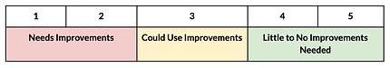
Question 1: On a scale of 1-5 (1 being very difficult, 5 being very easy), how would rate this page in terms of its navigability? Why?
-
Question 2: Which design do you prefer overall? Why?
After the tests were complete, I found the average score for each design to weigh in on user approval rating.

Results: Standard
1 80% preferred this design over Immersive, however only 20% preferred it overall, scoring a user satisfactory score of 3.76 (~75%).
2 70% successfully scrolled through the article, and used the clickable navigation on the left.
3 30% enjoyed the time and subject expectations displayed before the start of the article.
"The amount of time this should take me to read is great - lets me know right off the bat how long it is." — User
4 100% enjoyed the short paragraphs and icons included to break up the text.
"This is super easy to read because I can skim it if I want to and still gather all of the information." — User
5 100% unpromptedly noted that if JPM published this article, they would trust the content.
"I have no idea who this is for, but I can tell you that if, like, JP Morgan's logo was at the top, I would trust this even more than I already do because of the clean designs." — User
_1.png)
_2.png)

Results: Immersive
1 20% preferred this article design overall, scoring a 2.81 (~56%) satisfactory score among users.
2 70% did not know this was an article.
"Is this a student report? If so, I'd definitely hire them. But I feel like since the last design was an article, this should be too...but I'm having a hard time seeing that." — User
3 100% were confused and frustrated by the menu navigation and inconsistent scroll instructions.
"I tried to click the menu and it opened a new page?"
— User
4 100% wanted smaller paragraphs and larger text to make it more readable and scannable.
5 100% noted that if JPM published this article, they would trust the content.
"Again, I would hire this person who put this together - it's outstanding. I just don't see how it's an article and not an interactive report. But I do trust the information even though I don't know who's presenting it." — User
_3.png)
_4.png)
_5.png)

Results: Competitor
1 60% preferred this article design overall because of its scrollability, scoring a satisfactory score of 4.29 (~86%).
"I feel this one is better than the others because I can actually scroll through the page." — User
2 80% successfully scrolled through the article.
"I love scrolling on this page! The more I see here, it makes me want to click around and see what else they talk about." — User
3 80% found this article layout allows the content to be easier digested, read, and scanned.
4 100% enjoyed the short paragraphs and icons included to break up the text.
5 100% noted that since Morgan Stanley published this article, they already trust the content.
"The way this is set up would make me trust the content, but I already know it's Morgan Stanley. Trust is a no-brainer here." — User
_6.png)
_7.png)
Test Results: Key Takeaways
Trust & Credibility
All users trust JP Morgan and what it's attached to.
Describe the item and include any relevant details. Click to edit the text.
JP Morgan Designs
Users overall prefer Standard because of its familiarity, though they navigated the Competitor designs better because of scrolling clarity.
Describe the item and include any relevant details. Click to edit the text.
Accessibility
Users want and need more accessible text and color so they can better read, understand, and scan the text.
Describe the item and include any relevant details. Click to edit the text.
Recommendations & Next Steps
Final Decision: Standard
Standard wins over Immersive based on user preference and satisfactory ratings!
Make Minor Design Edits
Make minor design edits to Standard based on the following items:
-
Scrollability: Have items poke above the fold to show there is more on the page, or include built-in scrollbar like Morgan Stanley.
-
Accessibility: Avoid longer blocks of text and increase text size to 16pt to improve readability, scannability, and accessibility.
-
Overall: Increase contrast between text and backgrounds to assure AAA accessibility so users can better see clickable items and content.
Launch Designs!
-
Design team exports file to Zeplin to create interactive specifications document shared with development.
-
Development builds and launches new Standard Article Design, aligning with JP Morgan's rebrand!
